Data analysis is a core competency within the wider world of business analysis. Sound business decisions rely on evidence, insights, and predictions built on data. Having data can be a bit of a ‘comfort blanket’. If we have spreadsheets and graphs and numbers, it feels like we’ve been rigorous, and therefore our conclusions and choices will be good.
Unfortunately, there are many data hazards that can lead to misunderstandings and poor conclusions. In this post, I’ll look at ten data pitfalls to watch out for.

1 – Mistaking correlations for cause-and-effect
Being able to calculate a correlation is a really useful skill to have. Investopedia has a handy guide here. Determining the strength of a correlation can be great when exploring how different factors might be connected.
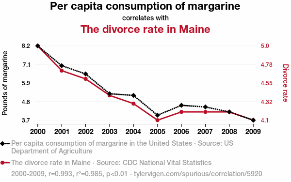
However, just because a correlation exists doesn’t mean that one thing is caused by the other. A might cause B, or B may cause A. A and B might both be caused by C – or they could in fact be unrelated entirely!
Correlations don’t prove cause and effect (and it pays to watch out for salespeople and demagogues who’d like you to believe otherwise!).
Tylevigen.com has many hilarious examples of absurd data correlations. I particularly enjoy the AI-generated explanations for each correlation!

A correlation can be useful in suggesting where to dig for more information and evidence, but should never be treated as sufficient proof of a causal factor.
2 – Failing to multiply probabilities
A 99% success rate sounds pretty good. That’s a one-in-a-hundred failure rate, and it feels pretty comforting. But what if every step of your process has a 1% chance of something going wrong?
Probabilities multiply. So if the ten steps in your process each have a 1% chance of failure, the whole process will be failing nearly 10% of the time. That can lead to a whole bunch of unhappy customers, or an abundance of waste and inefficiency.
As well as considering the failure rate across all steps of a process, it’s worth thinking about the different types of failure that could all occur at any step. Each individual step could have risks of errors in data capture, forgotten actions, security failures, poor communication, or delays. Multiply the probabilities of these to understand the real likelihood of success and target solutions appropriately.

3 – Statistical insignificance
Statistical significance is an important concept in scientific studies. Understanding that the results of a test are “statistically significant” means determining the probability that the results were not just down to chance coincidence. It’s an indicator that your results are reliable.
Statistical significance is greatly affected by the size of the data sample and the strength of the results. When looking at reviews online, a 5-star average rating from 5 users probably isn’t as reliable as a 4.5-star average from 100 users.
Performing calculations of statistical significance can get a little technical, but if you’re trying to draw evidence-based conclusions from data (e.g. from A-B testing), it’s worth getting your head around it!
4 – Selection bias
Your data could be skewed in a particular direction because of how you obtained your sample, and this can make it risky to extrapolate inferences and conclusions.
Opinion surveys are a notoriously tricky field in this regard. If your survey is only going to be completed by people who were free to talk in their local high-street at 3pm on Tuesday afternoon, or by registered users of a special-interest website, your results might not be representative of the wider population.
Who might not have been available to take part? Who might have actively chosen not to respond?
Will only the most and least satisfied customers get in touch?
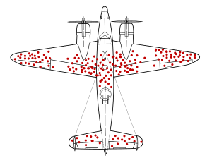
If you ignore the planes that never made it back to base, you probably won’t identify those parts of the plane that are truly most vulnerable! Survivorship bias is one of many ways our data sampling choices can mislead us.

Our means of obtaining data – and particularly opinions! – is often limited, so we must frequently make the best of what we can get. But it’s vital we remain clear-sighted about how representative our data is and the conclusions we can draw from our analysis. Be clear about what your data represents, and what it doesn’t.
5 – Using dirty data
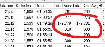
There are many ways in which data can become “dirty”. Data can often be incomplete., particularly if fields aren’t mandatory. Weird outliers can find their way in. For example, Strava thinks one of my runs took me to the edge of Space and back:

Dirty data contaminates analysis! Garbage In = Garbage Out.
Before diving in to number-crunching and searching for insights and conclusions, check the quality of the data and address any issues.
6 – Choosing the wrong ‘average’
When we speak of averages, it can feel like we’re being smart and scientific with our data. However, the term “average” can have various definitions, and it’s important to select the most useful for your needs (and to be clear about what you’re using!).
- Mean – the total of all values, divided by the number of values. What we generally refer to as the “average”.
- Median – when the values are ranked highest-to-lowest, the value in the middle is the median.
- Mode – the most commonly-occurring value in the dataset. Can be handy for identifying a “representative figure”, but doesn’t tell you much about the dataset as a whole.
Mean values are easily skewed by outliers; with larger datasets, you can remove the most extreme values to find a more useful average. Understanding whether your data shows a normal distribution – and if not, why not – is often valuable.
Pareto charts are a useful tool for understanding distributions. The “80-20 rule”, suggesting that big proportions come from inversely small proportions (e.g. 80% of the value comes from 20% of the work, or 80% of the effort is spent on the last 20% of the project) can be visualised in this form.
If you want to get really nerdy, you could look into standard deviations from the mean, which is something Six Sigma professionals get excited about!

7 – Missing the rate of change
Much of the data we come across in organisations changes over time. A snapshot view of totals or averages doesn’t give us the full story. Understanding how things are changing, and how quickly, gives us greater insight.
I like to think of the different ways of measuring movement. When considering a moving vehicle, we could simply measure the total distance moved. Or, if we factor in how long it took to cover the distance, we could measure velocity. How about the rate of change in velocity: acceleration? We could go even further, and look at the rate of change in acceleration (that’s jerk). This goes on, with jounce, crackle, and pop!
Understanding the rate at which change is occurring can be really powerful, particularly when providing data insight tools such as dashboards to business leaders. It can provide insights about when interventions are required.

It’s also worth ensuring we don’t inadvertently misinterpret changes to rates of change. A drop in the rate of inflation doesn’t automatically mean things have got cheaper!
8 – Assuming trends will continue
Just because things have been going in one direction for a while doesn’t mean they’ll continue that way!

External factors can stop a trend in its tracks. Some things, such as market size, or resources, may be finite. Consumer tastes change. Saturation and ubiquity can turn people off. Diminishing returns can kick in.
Data trends can also point to absurd outcomes when extrapolated to their logical conclusions. The wheat and chessboard scenario is a sobering reminder that even modest trends can snowball to unimaginable proportions.
Understanding the factors driving a trend, and the factors that may buck it, are key. And assumptions about trends continuing should be challenged robustly!
9 – Comparing apples and oranges
This sounds obvious, but failing to compare like-with-like is an easy trap to fall into!
We might find ourselves comparing objects where their superficial similarities mask fundamental differences, resulting in category errors. A business may sell both to individuals and other businesses, but lumping them all in as “customers” within graphs and reports might be unhelpful!
With data, we can find ourselves comparing things that are orders of magnitude apart in scale. This is a common error (or trick!) in political discourse where the difference between “millions” and “billions” is hard for many people to visualise.

10 – Assuming data = science
Having numbers can feel reassuring. If we can count or measure something, then we can explore totals and averages and trends. It feels like we’re being scientific and objective, and therefore our findings will be more rational and reliable.
To a degree, this is true. Evidence-led decisions rely on a rigorous approach, and number-crunching can be crucial. However, we can find ourselves treating vague or subjective concepts as if they are hard numbers, and then using these to perform analytical acrobatics.
Survey responses are a common culprit. We often ask respondents to provide ratings on a scale, or to choose between particular options. We receive crunchable data, and will inevitably start producing graphs and charts and drawing insights.
However, the scales and categories used in our survey are likely to be subjective and open to interpretation. One person’s “6” may be another person’s “7”. Imprecision or lack of rigour in building the survey may be masked by the attractiveness of the data outputs.
In conclusion
Effective data analysis is such an important component of good business analysis. It is crucial when considering process improvement and service design. Avoiding these pitfalls can help ensure your conclusions and insights are reliable and useful – which will result in better business outcomes!
