
In any process improvement initiative, it can be difficult to know where to begin. Targeting your efforts based on process performance helps you understand what’s working, what needs addressing, and what themes and common issues are at play. Measuring process performance has grown over the years into an entire industry and field of study – but sometimes you just need a ‘light touch’ approach to start uncovering insights and to get discussions flowing!
I’ve put together this simple template for evaluating and comparing process performance. It’s designed to act as a ‘rough and ready’ tool to enable high-level comparisons and provoke further conversations. You can complete it by talking to process owners, staff that do the work, or to customers. Alternatively, you can use it following detailed review or modelling of current state processes.
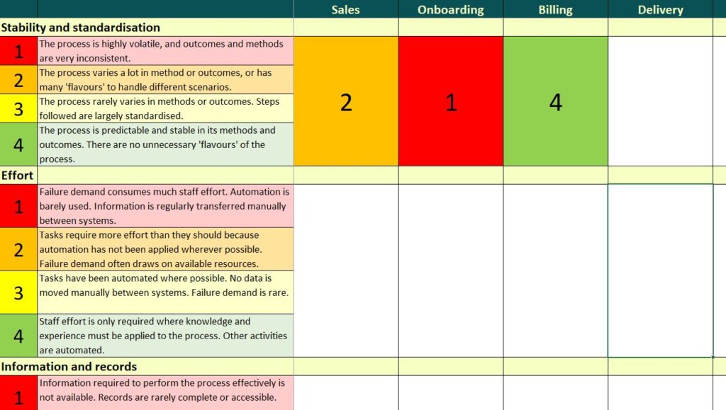
The spreadsheet template asks you to score processes against a series of criteria:
- Sustainability – can the business keep going with the process performing like this?
- Customer experience – how do customers feel about the process or what they get out of it?
- Staff experience – do your staff hate this particular activity?
- Stability and standardisation – are things stable? Do volumes keep changing? Are there lots of variations?
- Effort – how much time and resource does this process demand?
- Information and records – is data accurate? Are records complete?
- Monitoring and oversight – are effective controls in place? Can you see what’s going on?
- Roles and resources – are the right people doing the right things? Do resources match the workload?
- Risk – are there regulatory or compliance risks?
- Effectiveness – does the process deliver the right outputs at the right quality?
Scores are assigned from 1 (bad) to 4 (great). Each category has its own rough definitions to guide you, but you can tailor the scoring bands to meet your own specific needs or audience.
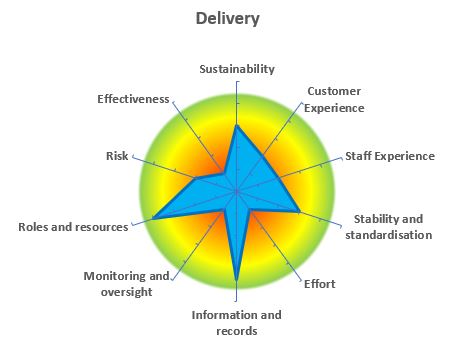
Once you’ve scored a process against each category, you can see a chart summarising its performance. It shows clearly which aspects of a process are up to scratch, and where there is need for improvement. The process may be delivering the right outcomes for customers, but it may require far too much time and energy from staff to keep it going. It may be controlled really tightly, but staff may hate doing the work.
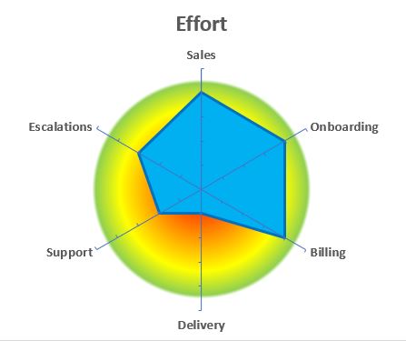
There’s also a chart for each category, so you can compare a group of processes. This can be useful in determining where to apply transformation or improvement efforts. If you’re looking to reduce costs, consider which processes are using too much effort. In this example, Onboarding and Billing look really efficient, but Delivery is consuming far too much effort.
These charts provide a handy visual aid for discussing process performance with process owners and other stakeholders. Rather than being scientific and prescriptive, this simple tool can help you quickly validate your understanding of where processes may need to be improved, or for challenging assumptions. It can help draw out common themes, or identify areas working well with ideas worth replicating elsewhere.
Feel free to adapt the tool to suit your needs. You could add other categories (such as financial performance, or competitive advantage), or make the scoring basis more detailed and comprehensive.